x
GMAT
Select Test Select Question Types

GMAT: Statistical Analysis With Categorical Data
Making Estimates And Predictions Using Quantitative Data

Watch this video lesson to learn how you can read a scatter plot to learn more about a particular situation. Also learn how you can make estimates within the range of data you have and predict what may happen outside the range of data.

Making Estimates And Predictions Using Quantitative Data

Quantitative Data

To begin, quantitative data is something that you can measure and write down using numbers. Examples include age, height and weight. These are all considered quantitative data because you can measure all of them and write down what they are in numbers.

Scatter Plot

The best way to represent quantitative data is with the use of a scatter plot. A scatter plot is a graph that plots each data point individually on it. You end up with a bunch of dots on the graph. Usually, you have one measurement of quantitative data on the x-axis and another on the y-axis. If a pattern emerges, then we can see that there is a relationship between the two pieces of quantitative data. If no pattern emerges and the dots look like they have been randomly placed on the graph, then there is no relationship and nothing more can be said about it. Let's look at an example to see how we can read a scatter plot.

Example11
Example10
Scatter plot showing data from hot chocolate cart business

Our scatter plot above shows some data we collected from our hot chocolate cart business. We wanted to find out if there is any relationship between the outside temperature and hot chocolate sales. We've plotted all of our data, and we see that the points do form a pattern. It looks like a line that is slanting downwards. Let me go ahead and draw a line below that is roughly in the middle of all the data. This is the line I can use to make my estimates and predictions.

kkkExample11
Drawing a line through the data can help in making estimates and predictions.

Making Estimates

Of course, any estimates I make will not be exact. As you see, the actual data can fluctuate slightly from the line in the middle. But, my estimate can give me an idea of what to expect. For example, looking at my graph and the line that I've drawn through the middle of the dots, I see that if the outside temperature is 30 degrees Fahrenheit, then I can estimate that my hot chocolate sales will be around $500.

I can look on the x-axis to find an outside temperature I am curious about and make an estimate about how much I can expect to make in sales at that temperature. You try. What can you expect to earn if the outside temperature is 60 degrees Fahrenheit? By locating 60 degrees Fahrenheit on the x-axis, you can see that the point where the line reaches 60 degrees Fahrenheit is roughly at $350, so you can expect to earn around that much.

Making Predictions

In addition to making estimates along the line in the middle of the data, I can also extend that line to predict what may happen at other temperatures. Remember, you can only make estimates and predictions for quantitative data that have a pattern to them. If you can't draw a line of some sort through the data, then you can't make estimates or predictions about it. I was able to draw a line through my hot chocolate sales data, so I can make estimates and predictions on it.

kkkExample12
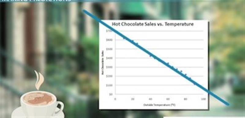
When there is a pattern to the data, you can make predictions outside of the data range.

To make predictions, I need to extend my line. Extending my line in both directions above, I can see that as the temperature gets warmer, my sales get lower. But, when the temperature gets even colder, my sales increase even more. I can predict that at 100 degrees Fahrenheit, it is possible that I could earn about $100. But, what about when the temperature is at 0 degrees Fahrenheit? What kind of sales can I predict? By looking at my extended line, it looks like I can expect to make about $700.

Share This Page