Center
When we talk about center, shape, or spread, we are talking about the distribution of the data, or how the data is spread across the graph.
The center of a distribution gives you exactly what it sounds like. It tells you the center or median of the data. When you look at a graph, it will be the value where approximately half of your data is on one side and the rest of your data is on the other side. The median point of your data set is the middle number if you were to put your data in ascending order. Let's say we are taking surveys of different groups of people and their donut eating habits. For the first group of people, we have this graph:
The center of this graph is 5.
We see that our center is 5 because half of the people are to the left and the other half are to the right.
Another way to describe the center is to take the mean or average of all your data. When you describe your center in terms of mean and median, you might find that they are slightly different. Your mean might be more or less than your median. We will discuss what skewed means in just a little bit, but as far as the center is concerned, if your graph is skewed, then you will want to use the median as your center.
Shape
Depending on the group of people we survey about their donut eating habits, we will get different sets of data. When graphed, we can get different looking graphs. We use shape to describe the different types of graphs we will see. There are four different ways in which we can describe a graph's shape.
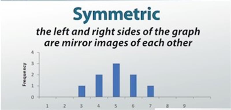
We can say a graph is symmetric if the left and right sides of the graph are mirror images of each other. The graph below, for example, is symmetric because the left side is a mirror image of the right side. We see that, at either end of the distribution, only 1 person chooses to eat 3 donuts and 7 donuts. Going closer to the center, we see that 2 persons choose to each 4 donuts and 6 donuts. They are mirror images of each other.
Example of a symmetric graph
Sometimes, our graph will look like a rollercoaster and will have a number of peaks, or areas where the graph is higher than the surrounding areas. If there is only one peak, then we call it unimodal. If this one peak occurs at the center of the graph, it is also called bell-shaped. Doesn't the graph below look like a bell? If it has two peaks, then we will call it bimodal.
kkk
Example of a bell-shaped graph
If our graph has more data on one side rather than the other, we call it skewed. If there are more to the right, we call it skewed left. For our donuts eaten survey, this would mean that more people choose to eat more donuts and fewer people choose to eat just a few. If our graph has more data to the left, then we would say that our graph is skewed right. For our donuts survey, it would mean that more people prefer to eat fewer donuts. A good way to remember this is to view the graph as a slide. If you slide down to the right, then it is skewed right, and if you slide down to the left, then it is skewed left.
If our survey of people's donut eating habits showed that for each amount of donuts eaten, the same number of people would choose that amount, then our graph will look flat all across the top, then we call it uniform. A uniform shape has no peaks nor is it skewed.