Line Graphs
Line graphs are cool! They are cool to look at, and they provide so much useful information once you know how to read them. You know when you are looking at a line graph when you see a graph with a line connecting the data points. The line can be straight, or it can be curved, or it can look like a connect-the-dots line. Whatever the case, there is so much information to be gained from these graphs.
Reading a Line Graph
Let's look at the line graph below that shows us the number of correct math problems a particular friend of ours gets right in one minute over the course of a week. Our friend, Joe, is taking a timed math test every day for a week. He is given a minute to solve as many basic arithmetic problems as he can. At the end of the minute, his work is graded, and the number of correct answers is noted down. Let's see what information we can gather from the line graph that was produced from his results.
kkk
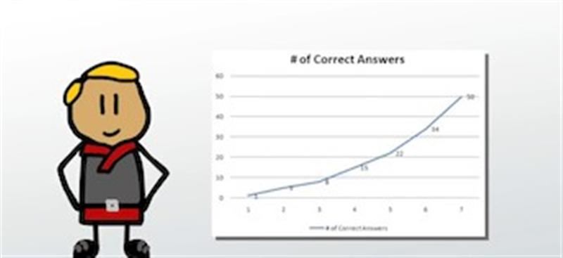
Line graph showing number of correct math problems per minute
We see that on day 1, the first day, Joe didn't do very well, with only 1 correct math problem. I see this by looking at the bottom x axis first to locate day 1, drawing an imaginary line straight up, and then looking to find where our actual line crosses the imaginary line for day 1. I find the point where they cross, and then I draw another imaginary line across to see where it hits on the y axis. I see that it hits the y axis at 1, so Joe only got 1 correct math problem.
I keep reading the graph to gain more information. I look at day 2. How many math problems did Joe get right that day? I see where my line crosses day 2, and I see that it is where the y axis equals 5, so Joe got 5 correct math problems on day 2. On day 3, Joe got 8 correct answers. Day 4, he got 15. Day 5, it is 22. Day 6, Joe got 34 correct answers. And at the end of the week, on day 7, Joe was able to get 50 correct answers in one minute. Now that we've read our graph, what kind of interpretations can we make about Joe?
Interpreting a Line Graph
Reading a bunch of mathematical information from a graph is kind of meaningless unless we can interpret that data. What do all the numbers we read from the graph tell us about Joe? Looking at the line, we see that it keeps getting higher and higher. That is good for Joe. We can see that as the line gets higher, Joe's number of correct answers also gets higher. That means that Joe is doing really well. He is progressing in his math ability every day. He started out a bit slow, but then he started understanding more quickly. We can see this by the way the line curves slightly upwards.
We can also make an interpretation of what may happen to Joe's mathematical ability if he keeps going. It would make sense for the line to keep following the same pattern of going up, so if Joe kept this up, he'd be able to do more math problems in a minute on day 8 and day 9. Whether this will happen, we can't be sure, but based on the information we have, it seems likely. We just can't say that it will definitely happen.