What Is Categorical Data?
When you take a survey or fill out application forms at various places, you come across categorical data. So, what exactly is categorical data? It is the kind of information that can be categorized. For example, your race, gender, and occupation are all different types of categorical data. Your answer for race can be categorized into groups such as Asian, Caucasian, etc. For occupation, your answer can be categorized into groups such as teacher, student, artist, etc.
Data as Percentage
With this type of data, part of the analysis process involves changing your data into percentages. Let's work through an example scenario to see how the analysis process works. Our scenario is that we have just surveyed a group of 100 people about their natural hair color. After going through all the data, we found that 30 people had brown hair, 20 people had blonde hair, 40 people had black hair, and 10 people had red hair. Notice how we were able to group the people in our survey into just a few groups. For each person that answered a certain way, we added a 1 for that group. Now that we have this information, we need to analyze it and present it in such a way that makes it easy to understand and use. Having just our numbers doesn't do much for us. But, if we change the numbers to percentages, we can gain a better understanding of what's going on.
To change our numbers to percentages, we take the number from each group and divide it by the total number of data, and then we convert this decimal into a percent by multiplying by 100. For our brown hair, we divide 30 by 100 to get 0.3. 0.3 multiplied by 100 is 30%. For blonde hair, we get 20%. For black hair, we have 40%, and for red hair we have 10%.
Data Table
Now that we have our percentages, we need a way to present it to others for it to make more sense. One way we can present it is with a data table, which is a way to organize the information into rows and columns. We will present it with a title row and our information in two columns. The title row will state what each column is for. The first column is for 'Hair Color,' and the second column is for the 'Result.' We write our groups in the column for Hair Color, and we write our respective percentages in the next column.
kkk
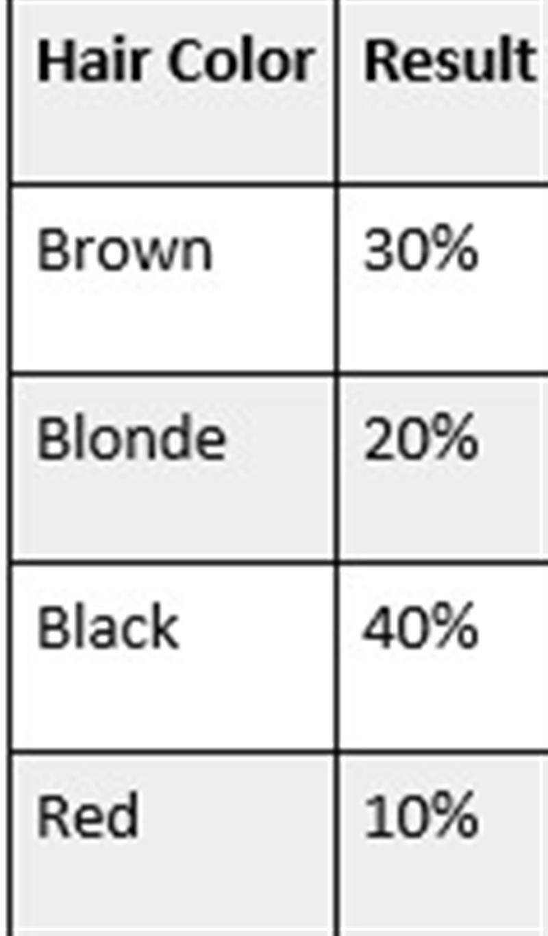
We can glance at our finished table and quickly gain the information we need. We can look at it and easily see that 40% of our population has black hair. We can use this information for business purposes if we wanted to market hair accessories for people. If we know that the majority of our population has black hair, then we will produce more accessories that match with black hair.